After a decade of "Millennial Pink" and the sterile dominance of "Gallery White" and "Cool Gray," the design world is collectively exhaling. We are moving away from the clinical and the digital, and returning to the soil. "Earthy Tones" are the definitive palette of 2024, representing a deep, societal craving for grounding, warmth, and a connection to the natural world.
This shift is not just an aesthetic trend; it is a psychological response to our fast-paced, high-tech lives. When our eyes are constantly bombarded by the blue light of screens, our brains seek the soothing, low-vibration frequencies of terracotta, clay, olive, and rich umber. These colors don't shout for attention; they provide a quiet, stable background for our lives. In an earthy room, you don't feel like a visitor in a museum; you feel held by the space. In this detailed exploration, we will look at how to master these natural hues to create a home that feels timeless, sophisticated, and deeply restorative.
Table of Contents
1. The Psychology behind the Palette: Why We Crave Nature
Color psychology tells us that the hues we surround ourselves with have a direct impact on our nervous system. For years, the trend was "Bright & Airy," which often translated to high-contrast whites and blacks. While this looks great in photos, it can actually be quite stimulating (and sometimes stressful) to live in day-to-day.
Earthy tones operate on a different frequency. These are "low-chroma" colors—they are muted, often with brown or gray undertones. Because they are the colors we find in the wild (stone, mud, dried grass, autumn leaves), our brains associate them with safety and stability. This is why earthy living rooms are so effective for relaxation. They mimic the "shelter" of a cave or a forest canopy. Furthermore, these colors reflect light in a softer way than pure white. They absorb a bit of the glare, creating a "velvety" atmosphere that makes the room feel physically warmer, which can even lead to lower heating costs in winter as we perceive the temperature to be higher in a warm-toned room.


"Color is the keyboard, the eyes are the hammers, the soul is the piano with many strings. The artist is the hand which plays, touching one key or another, to cause vibrations in the soul."
2. Defining the Modern Earthy Palette
When people hear "brown," they often think of 1970s wood-panelled basements. But 2024’s earthy palette is much more sophisticated. It is about "Terracotta," "Sage," "Burnt Sienna," and "Ochre."
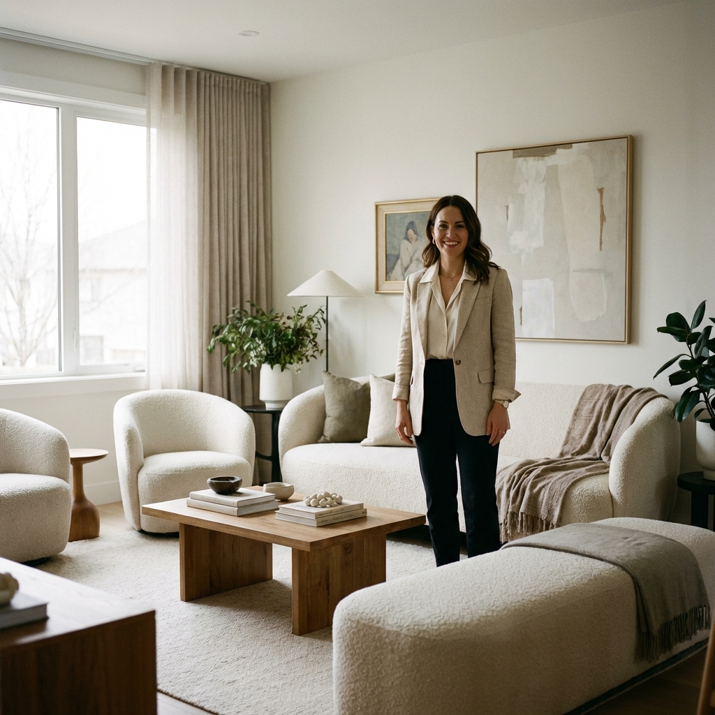
Terracotta and Rust: These are the "heart" colors of the palette. They add an instant sense of history and sun-baked warmth. They work beautifully as an accent wall or on large upholstered items like a velvet sofa.
Sage and Moss Green: These act as the "neutral" of the earthy world. They bring the calming energy of the outdoors in. Unlike bright greens, sage has a heavy gray undertone that makes it look sophisticated rather than grassy.
Sand and Taupe: These replace the cold grays of the last decade. They provide a soft, creamy background that allows the richer earth tones to pop without creating a high-contrast jar to the system.


Testing is key. Earthy tones change dramatically based on your home's lighting. Always test a large patch before committing.
3. Material Harmony: Pairing Color with Texture
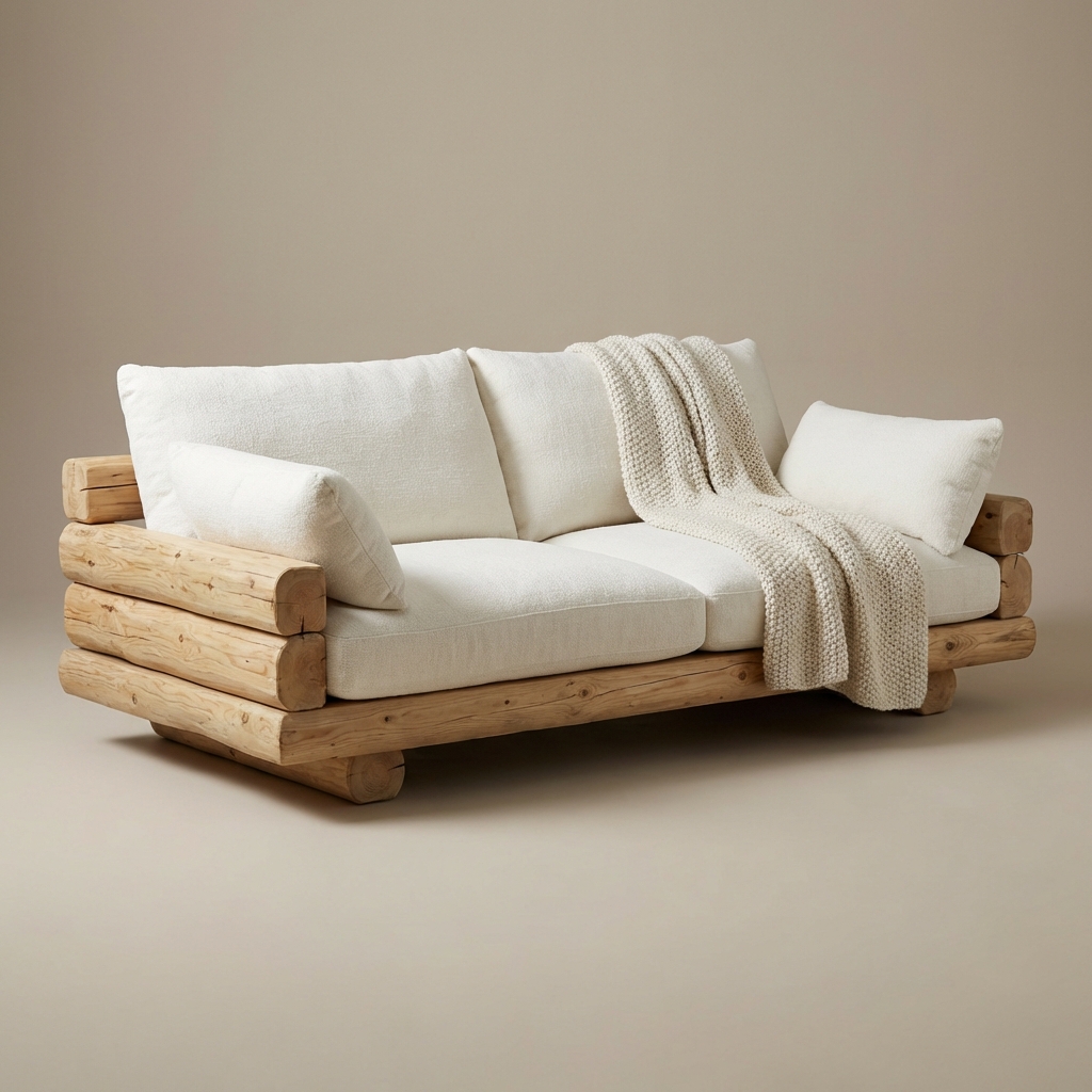
Earthy colors fail if they are applied to flat, synthetic surfaces. These colors *demand* texture to look their best. In nature, color and texture are inseparable—think of the roughness of bark or the grain of a stone.
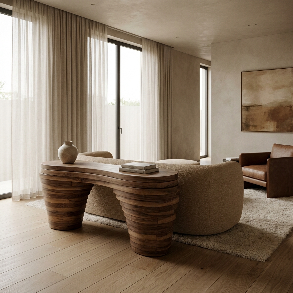
To make the palette work, you must introduce "Tactile Materials." Pair a terracotta wall with a chunky wool rug. Place an olive green lamp on a raw oak sideboard. Use brass or copper hardware instead of cold chrome; the warm metallic reflection perfectly mimics sunlight hitting the earth. Linen is another essential partner. The natural, irregular weave of linen fabrics catches the light in a way that accentuates the depth of earthy dyes. By layering these materials, you create "Visual Depth"—the room feels layered and lived-in rather than "staged."
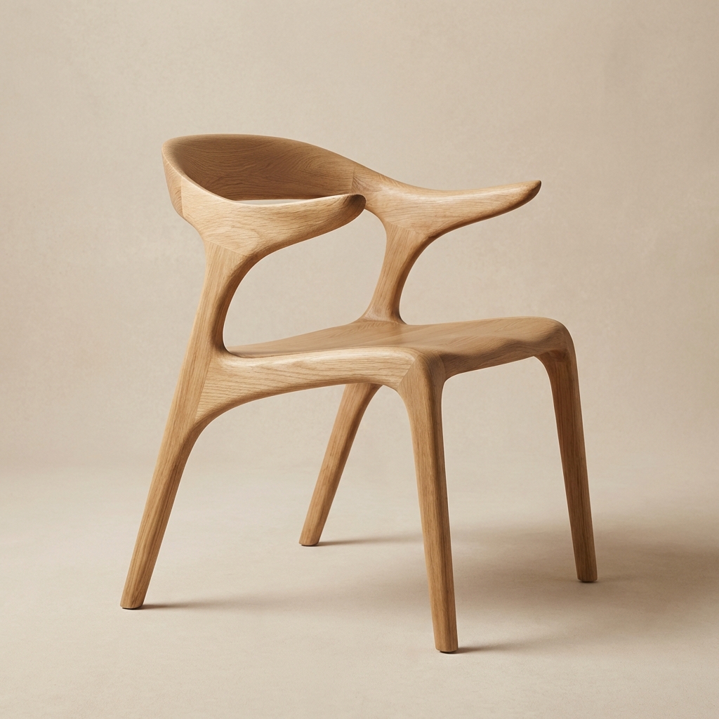
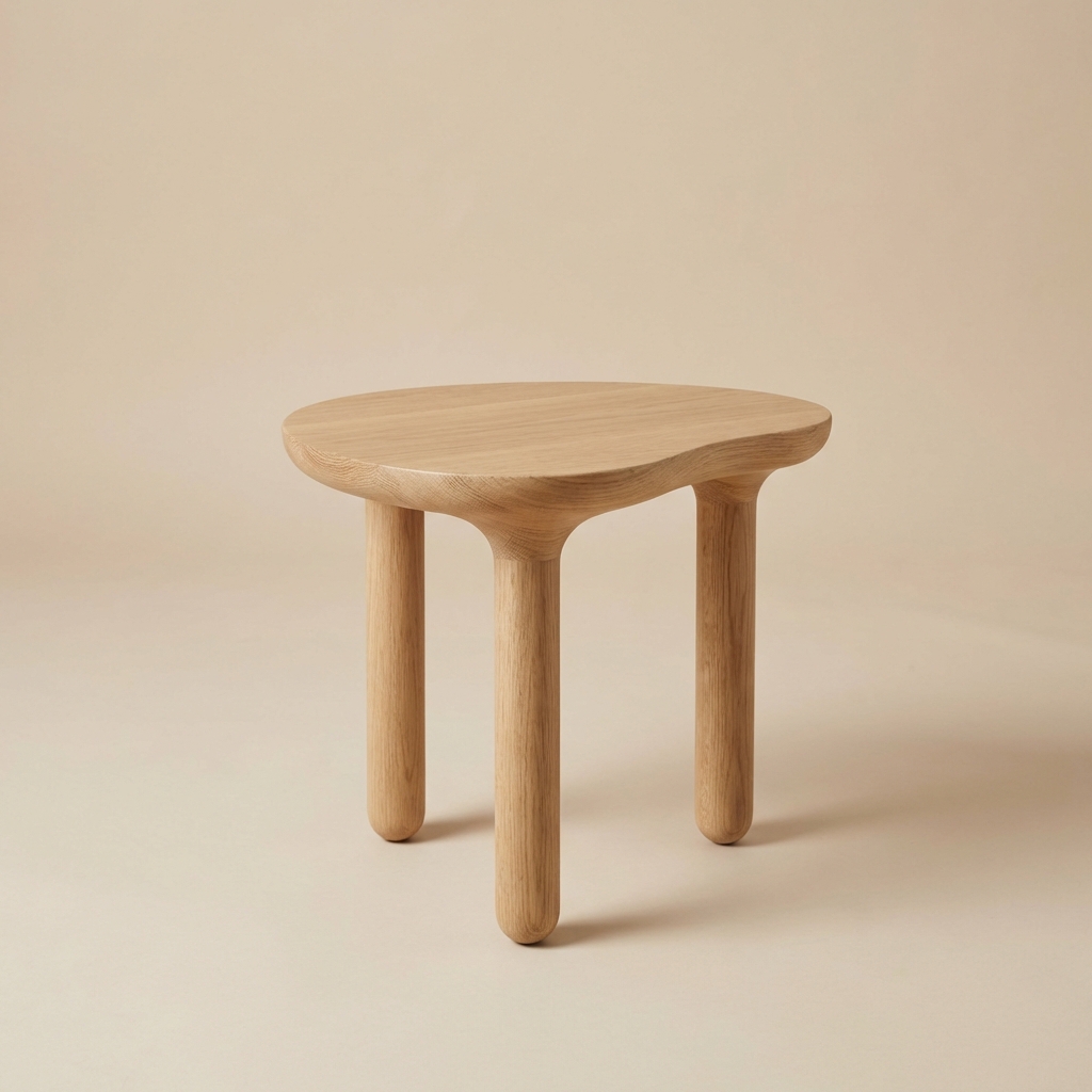
Medium-toned woods like oak and walnut are the perfect anchor for an earthy room. They provide the "brown" baseline that holds the palette together.
Using "tonal" layers—different shades of the same color—creates a sophisticated, monochromatic look that is incredibly calming.
4. Incorporating Earthy Tones in Every Room
You don't need a total overhaul to embrace this trend. Start small and expand as you feel comfortable with the warmth.
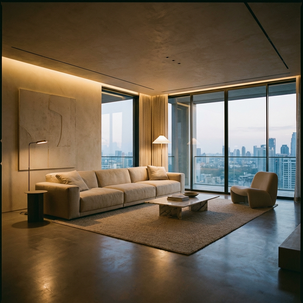
The Living Room: The heart of the home is the best place for bold earth tones. Consider a "statement" piece like a rust-colored velvet sofa or a set of olive-green armchairs. Add plenty of plants to bring in literal green and life.
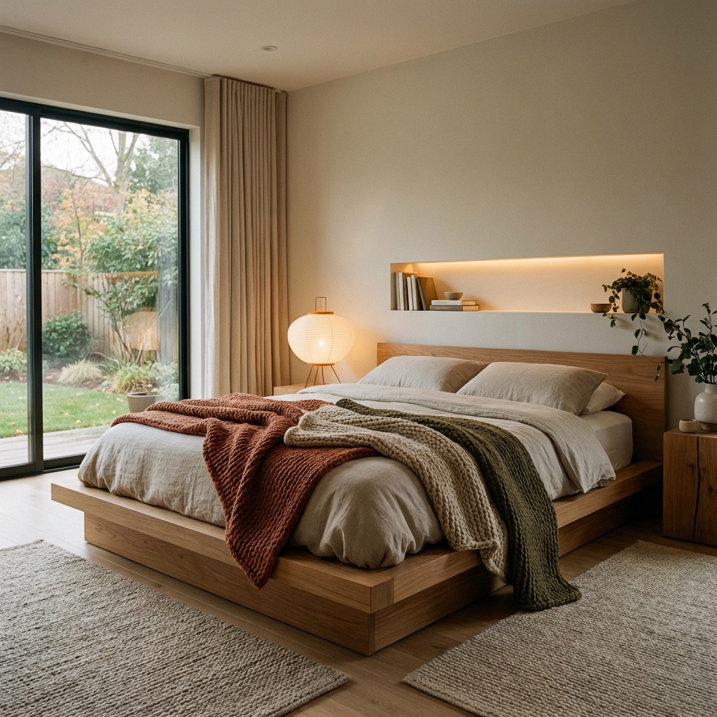
The Bedroom: Stick to the lighter, calmer side of the palette. Sage green bedding paired with sand-colored walls creates a serene, forest-like environment that is perfect for sleep. Avoid high-energy "ochres" here.
The Kitchen: Earthy tones in the kitchen feel "Chef-led" and professional. Terracotta tiles, a backsplash of hand-fired clay, or even just a set of ceramic bowls in sunset hues can take a sterile white kitchen and make it feel like a Mediterranean villa.

Frequently Asked Questions
Conclusion: Coming Home to Nature
The beauty of earthy tones lies in their honesty. They don't try to hide the imperfections of a room; they celebrate them. They turn a cold house into a warm home by bringing in the colors that have grounded humanity since the beginning of time.
As you plan your next room refresh, don't just look at what's "new" on social media. Look at the world around you. Look at the color of the soil after a rain, the bark of an old tree, or the soft green of a leaf in the shade. These are the colors that will truly nourish your soul. Take a chance on that terracotta paint or that olive armchair—your nervous system will thank you.
 Connect with
the
Earth
Connect with
the
Earth

Sarah Jenkins
Color Consultant & Interior Designer
Sarah specializes in Biophilic Design—the science of connecting humans with nature through their built environments. She has been named one of Indonesia's 'Top 50 Designers to Watch' in 2024.
Join our Inner Circle
Get first access to new collections and interior design masterclasses.